Secret Behind a Balanced Logo
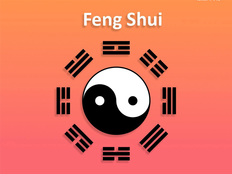
Secret Behind a Balanced Logo: Utilizing the Concept of Feng Shui in Logo Design Have you ever looked at a logo and felt, without knowing exactly why, that it just feels right and pleasing to the eye? Not only does it look visually appealing, but it also gives off a perfect vibe. That’s the energy balance of the logo at work and you can achieve this by incorporating the principles of Feng Shui. Feng Shui is an ancient practice that is based on the flow and balance of Qi (energy). By applying its key elements — Element, Color, and Shape — in a harmonious way within your logo, you can create an energy-balanced design that enhances your brand's success and builds trust with clients.
Let’s dive in ☟☟☟ The Five Elements of Feng Shui In Feng Shui, there are five main elements: Fire, Wood, Water, Earth, and Metal.
1. Fire 🔥
- Colors: Red, Orange, Magenta
- Represents: Passion, Motivation, High Energy
- Best for: Restaurants, Sports, Entertainment
- Shapes: Circles, Flames, Triangles
2. Wood 🌳
- Color: Green
- Represents: Growth, Freshness, Renewal, Health
- Best for: Restaurants, Sports, Entertainmen
- Shapes: Tall rectangles, Natural plant-like shapes
3. Water 🌊
- Colors: Blue, Soft White
- Represents: Flow, Creativity, Emotions, Wealth
- Shapes: Waves, Curves, Fluid forms
- Best for: Travel, Finance, Music, Counseling, Spiritual brands
4. Earth 🧱
- Colors: Yellow, Brown, Earthy Red
- Represents: Support, Stability, Trustworthiness
- Shapes: Squares, Hills, Solid Foundations
- Best for: Real Estate, Law, Agriculture
5. Metal ⚪
- Colors: Gray, Gold, Silver, White
- Represents: Clarity, Structure, Precision, Elegance
- Shapes: Circles, Ovals
- Best for: Luxury brands, Design Studios, Social Media/Tech
You can also add auspicious symbols to your logo for extra positive energy:
- 🐉 Dragon – Success & Power
- 𓆝 Koi Fish – Wealth & Prosperity
- 🪷 Lotus – Purity & Spiritual Growth
- 🎋 Bamboo – Longevity & Strength
You might also ask - Can I use black in Feng Shui logos? Yes!
Black is associated with the Water element. It symbolizes wisdom and can be used to create a professional or luxurious look — as long as it’s not overused.
However, combining black and red (Water and Fire) can create very intense energy, so the proportion and context matter a lot in this case.
⚠ Feng Shui Design Tips for Logos: Since Feng Shui focuses on the flow of Qi (energy), avoid these design issues:
- ☞︎Cluttered or overly complex
- ☞︎Overfilled with too many elements
- ☞︎Excessive sharp edges or spikes
- ☞︎Using conflicting elements or colors (e.g., Fire and Water / Red and Blue)
For natural energy flow, direction matters: → Design elements (like arrows or strokes) should move left to right → Avoid splitting or breaking the central part of the logo
Bonus tip - Balancing Yin & Yang Energy ☯︎︎
Yin: Soft, calm, feminine, tranquil
- Colors: Blue, White, Pale Green, Gray
- Shapes: Waves, Curves, Circles
Yang: Active, bold, masculine, vibrant
Balancing Yin and Yang energy in your logo creates harmony and helps convey a complete message visually and energetically.
Now you have a solid foundation on how Feng Shui principles can enhance your business logo.
Based on the message your brand wants to convey, choose the right elements, colors, and shapes and ideally consult with a graphic designer who understands Feng Shui.
A good logo should not only look appealing to the eye but also feel right to the heart and Feng Shui can guide you toward that perfect balance.
Feel free to check out my work profile here. You can contact me for work or inquiries: ☟︎☟︎☟︎
Related Posts

How color theory supports strong branding?
01 Nov 2025